
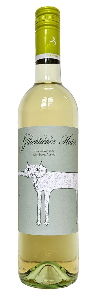
Kater in a bottle
Das hier sind Weinetiketten die im Rahmen eines Wettbewerbs für das Weingut Dürnberg designed wurden. Man nehme sie mit einer guten Priese Selbstironie, denn von guten Wein bekommt man ja bekanntlich keinen Kater 😉
Für jede der vier unterschiedlichen Weine wurde ein anderer Kater illustriert, der einmal um die Flasche herum geht und sich selbst in den Schwanz beißt.


Frühlingsgefühle zum Pflücken


Veggiezz Foodtruck Plakate
Veggiezz ist ein veganes Restaurant, welches nun auch ortsungebunden mit einem Foodtruck durch die Gegend fährt und alle mit veganen Würstchen (höhö) versorgt. Anlass der Plakate war die Veganmania (veganes Event) auf der Donauinsel


Looking for jobs
These posters were designed in the process of me looking for commissions as I am just starting to freelance. They will be hung all over Vienna when this website is finished.


Logo design
This is a logo I designed for a group of four Climbers (from Romania). „prb“ is an acronym for „pe roci băieți“ which tanslates to „guys on the rocks“. I took the meaning very literal…
another logo
This one was developed within an university project that I did with my colleague Hannes. The project was about helping small businesses to survive the various corona lockdowns. So the two of us created the „anti-discount-campaign“. I will explain & display further details below, the logo, however, is made up of a percentage sign (%) used as the nose and eyes of a sad-looking smiley (and the lettering „anti“).
I draw whatever
you want


Die Klette
„Die Klette“ is a youth magazine from Wiener Neustadt. I layouted a couple of issues for them and am particularly proud of the cover pages.
First up, we have the cover page of the LGBTQAI+ edition, which we called „kunterbunt“. The name „kunterbunt“ is spelled using letters as diverse as can be. You might wanna take a closer look at the letter „K“, which I created out of nipples. The letter „T“ is my eye with the stem of an oyster mushroom, in case you were wondering.
The other issue discussed true crime topics. And I don’t know about you, but when I was a kid, I more than once used Ketchup and pretended it was blood. Therefore, Ketchup made it onto the cover page (applause & cheering).


Logo für die Tierarztpraxis 19
Impro-theatre posters
Impro(visation)-theatre can get quite messy. Scenes and dialogs are made up on the spot and require quick thinking (or no thinking at all). If one starts to acceptingly engage in the flow of the spectacle, that’s usually when the funniest scenes emerge.
Additionally, impro-theatre poses a great chance to achieve a better understanding of oneself, connect with one’s emotions and gain self-awareness.
The poster displays our Trainer „Don“, sitting on a chair that is still folded, explaining how to exaggerate emotions. Just for the hell of it, I gave him a bowl of Udon (Don – Udon – Udon-Don – U Don…lol) and on the other version a deep-sea-fish to hold. This is supposed to emphasize how absurd impro-theatre can sometimes be.


Döner Tasche ist Designer
Das Restaurant „Nalin“ hat auf seinem Menü „Döner Tasche“ stehen. Ich fand das so lustig und konnte nicht widerstehen:


Geilo Sans
Geilo Sans is a font that I created in my second semester of Angewandte (so a while back, summer semester 2021 I think). Our task was to design a reading-font and I quote my teacher here: „When reading, you should not notice any details of the typeface“. To achieve this goal, I decided on a relatively round, sans serif font with high x-hight.
Creating the final poster, I thought about how I can break the rule „when reading, you should not notice any details of the typeface“. and voila:


Design and environment
Another university project, which aimed to connect design and environment. I decided against the educational do-this-don’t-do-that-approach and rather headed for re-awakening a certain feeling: the connection with the environment. I think we all know what that feels like, however, living a busy city life, we tend to forget about this connection we have with nature.
To emphasize the feeling, I picked a quote from a poem by Rilke. Just reading those words gave me goosebumps<3 Additionally, I illustrated some animal, which is supposed to be this dark, scary but in the end still caring thing inside of my soul (maybe you know that part inside your soul too?) holding and protecting the trees.

Something chaotic probably
This is another project I did in typography class at uni:
we had to layout our fellow student’s creative text. First, our professor gave each of us a photo, then we spontaneously had to write about whatever popped into our head when looking at the photo and afterwards, we exchanged our texts. I got Leonie’s text, which was very chaotic and about a girl standing in a field of flowers. So I tried to connect these two things and decided to print the text onto coloured paper and create flowers out of it. The headline says “something chaotic probably”, which were her exact words when I asked her what she expected the text to look like in the end.
The flowers with the text have Leonie’s handwriting on the one side and the computer-written version on the other side. This is to display Leonie’s chaotic handwriting, which adds a vibe to her text but also makes it possible for the viewer to be able to properly read the text. Additionally, there are also white flowers on the poster which show an image of the girl, since the text is closely linked to the image. The flowers can be unfolded to read/look at the text and regard the image.


Anti-discount-campaign
As already mentioned above, the anti-discount-campaign was the result of a uni-project, which tasked us with supporting local businesses during the pandemic. Hannes‘ and my idea was, to create anti-discounts, that work just like discounts, except, the customer pays a little more rather than a little less. This, of course, is all on a voluntary basis. We created some anti-discount sticker that could be put on products (plus 5%, plus 10% and so on). Additionally, we made a sticker pass for customers to collect stickers that they got from the cashier for every anti-discount that they payed. To display participating businesses, we designed huge stickers for the shop windows.


